Advertising Greatness #2: Avis

It's 1962 in America, and the car rental market is pretty simple, Hertz are the leaders in the market by a country mile. Avis was failing, it had only 11% market share and hadn't made a profit in 13 years.

Avis appointed maverick businessman Robert Townsend as CEO, tasking him with turning the company around. One of the first things Townsend did was to call Bill Bernbach at Doyle Dane Bernbach, his plea: "How do we get five dollar's worth of impact for every dollar we spend?"

In answer, Bernbach demanded that they got 90 days to learn about the business, that Avis run every ad without changing a thing, and that they didn't run any advertising until they'd got their actual service up to scratch.

Bernbach put art director Helmut Krone and writer Paula Green on the project, and the team set about finding out as much as they could about Avis and its people.

What they created was an idea that broke the mould of advertising. To give it some context, Hertz's were running ads like this at the time...

Krone, Green and Bernbach created a solution that was, like all great advertising, strategy and creative idea in one, and firmly rooted in something truthful. "Avis is only No.2 in rent a cars. So we try harder". It was an amazingly simple idea that sprung from their conversations with staff at Avis. The honesty of the idea, and the writing was powerful. And it made sense - Avis had to do everything better than Hertz to win customers. This didn't feel like advertising flim flam, but a truthful message from a company to the consumer. And amazingly, at the same time, it also managed to position the massive, strong market leader as complacent and sloppy.

Krone (who was previously responsible for the look of the Volkswagen campaign) created a strong look for the campaign based on large headlines and copy, and small images. The ads were unmistakably Avis, but didn't have a logo. Their great branding came from the fact that the ads were, from start to finish, all about Avis and their message. There was no creative fluff, no cleverness for the sake of it. Just great communication. Krone made simple, editorial pages that demanded to be read.

The key things about this campaign were a strong, truthful advertising idea, a great tone of voice (self-effacing, smart) and strong, simple art direction.

A lot of modern advertising suffers from some common things that generally don't help; thinking that advertising strategy is a separate thing from the advertising idea, trying to have the advertising idea before you get the creatives involved, trying to fit everything into every execution, two 'leaps' - interesting strategic idea complicated by a separate creative idea, over-complication at any stage, creatives trying to be too 'clever', mistaking big logos and brand guidelines for good branding, and worst of all - lack of balls.

The Avis campaign is something good to always refer back to if you think you're suffering at the hands of any of those things. It has a purity of thought and execution that a lot of today's marketing lacks. Of course, none of that would matter if the campaign wasn't commercially successful. Within one year of the campaign breaking Avis was making a profit. And by 1966 Avis' market share was 35% - over three times bigger than before Townsend and Bernbach got involved.

That, my friends, is Advertising Greatness.

Previous Advertising Greatness: #1 The Nauga

Read more Sell! Sell! On Advertising here.

Tippers Live Longer

Excellent tip gathering slogan from the people at our favourite local coffee place.

Is Radio Unloved?

I was asked to judge this month's Aerial Awards. This meant I had the dubious pleasure of sitting through a CD of radio ads playing back to back.

There were a couple of good ones on there, but what struck me was the similarity between the vast majority of them - similar voiceovers, similar tones-of-voice. Similar rubbish little scenarios.

It got me to thinking about radio ads and how unloved they seem within agencies. And how under-exploited they are as a medium.

Is it because in a lot of ad agencies, radio is seen as a way of letting juniors cut their teeth, before getting stuck into TV? In one big agency I worked for, there was definitely an unwritten hierarchy of media that you got to scale as you proved yourself - and I can tell you radio was not at the higher end.

There are a few top-notch writers who do radio ads, but generally I've seen them passed down to juniors. Now this certainly doesn't necessarily mean they'll be worse - there's no saying junior writers couldn't write a better ad than a senior. But it does seem indicative of the lack of love for the medium within agencies. I wonder if it's partly due to there being a lack of something to look at when it's finished? I've never seen a creative, or an agency dig out its best radio spots to show off their skills.

It would help if everyone would stop trying to cram everything into every radio spot. When was the last time you wrote a phone number down off the radio? When was the last time you remebered the URL that was hastily tacked on at the end? There is so much thrown in to a lot of them that even if there was a strong communication in there at one point, by the time it hits the airwaves, it's become a mush of noise amongst similar noise.

And that's why, on that Aerials CD, the simple ads that Mother produced for Coke stood out. It was actually refreshing (ahem) to hear them, among the mess of people yabbering at me from the speaker.

There have been some great radio commercials. But generally there doesn't seem to be the same level of innovation, craft and energy put into them. Maybe that's why specialist radio companies have sprung up and prospered?

When used well, radio is a powerful and effective medium. And it can make other media more effective when it's on the schedule. Maybe it deserves a bit more love?

Transformers

More excellentness from Swiss/French artist Guillaume Reymond. Read more and see the 'making of' videos here.

Game Over

The Game Over Project by Guillaume Reymond.

Tetris


Pole Position


Space Invaders


Pong


A YouTube 2007 Video Awards winner with over 10 million views. But still always worth another look. Find out more here.

Classic Sweets


This week we have a blast from the past.

Classic Sweets.


1. Cola Bottles


2. Millions


3. Pear Drops

4. Blackcurrant Liqorice

5. Midget Gems

It was a tough choice. Some other favourites that came close were giant strawberries, Everton mints, sherbert dips, kola kubes and bon bons.

Any other favourites we missed?

Previous Top 5 Tuesdays:
Film Titles

Olde Maps


On a weekend trip to Bath I happened across an antique map shop. I love maps, I never realized how much until I seen some of these beautiful maps on display. As a kid I loved looking at maps and atlases, in my school there used to be a large world map in each classroom and no two were ever the same. I loved the range of colours and differing line weights, and how the shapes and boundaries of countries changed through time. Each map had subtle differences and their own characteristics, no matter how long you spent looking at them you could never quite take it all in. I didn’t have a camera handy at the time but I’ve inevitably found a flickr pool dedicated to old maps.

D&AD Annual


The new D&AD Annual is now available online for a limited period only. For the next month non-members can access this slick digital version.

4 Presidents

4 Presidents

Four United States Presidents get caught up in a tornado, and off they whirl to the land of OZ.

They finally make it to the Emerald City and find the Great Wizard.

"What brings the four of you before the great Wizard of Oz?"

Jimmy Carter steps forward timidly: "I've come for some courage."

"No Problem," says the Wizard. "Who's next?"

Richard Nixon steps forward: "Well, I think I need a heart."

"Done," says the Wizard. "Who comes next before the Great and Powerful Oz?"

Up steps Bush: "The American people say that I need a brain."

"No problem," says the Wizard. "Consider it done."

Then there is a great silence in the hall. Bill Clinton just stands there, looking around but doesn't say a word.

Irritated, the Wizard finally asks, "Well, what do you want?"

"Is Dorothy here?"

Cheese And Onions


It still surprises me how many people have never heard of The Rutles. 

Neil Innes and Eric Idle's wonderful send-up of The Beatles is essential viewing for anyone who's a fan of Monty Python, The Beatles, Spinal Tap, Flight Of The Conchords, "mockumentaries", cheese.  And onions.  

Si Scott Interview

I'm a big fan of Si Scott's illustration work. I have a particular soft spot for this piece after I seen it in the flesh at an exhibition last year, the detail is amazing. He has just given an interview with Computerlove. Worth a read.

via cpuluv

Film Titles


A shiny new feature of the Sell!Sell! blog is our Top 5 Tuesday. From here on in we will be posting a top 5 list of interesting things we like.

To start us off this week and following on from my previous post we have:

Film Titles.


1. Psycho


2. Se7en


3.Oceans Eleven


4. Catch Me If You Can
Click here to view


5. Ironman

Click here to view


For more title sequences check out The Art of the Title Sequence.

We love a good film, title

Here at Sell!Sell! we love a good film title, yes film titles. Often underrated a well-considered title sequence can help bring a film to life. Firm favourites are the Saul Bass titles and in particular his work on Hitchcock’s Vertigo.


More recently the Iron Man title sequence is a visually stunning example of how titles should be made. So we were delighted to read a great interview with Kyle Cooper and Danny Yount of Prologue Films who created the Iron Man titles, and also Richard Morrison from Th1ng who created the titles for Sweeney Todd and Vantage Point among others, in this months Idn magazine.


Kyle Cooper is also speaking at the D&ADs Presidents Lectures in October. Definitely worth a visit.

Adobe CS4

It doesn't seem that long ago that Creative Suite 3 was released but a week today Adobe will be unveiling CS4 via a live webcast. Very little is known about CS4 although there are some leaks on the web. Ive signed up for the webcast out of curiosity but as yet I don't really see the need to upgrade. I had enough problems upgrading the last time.

Advertising Greatness #1: The Nauga

It's the 60's in America, and UniRoyal have created a synthetic fabric called Naugahyde, that is used as an alternative to leather for covering furniture. The problem is that lots of other people have come into the market with similar synthetic leathers. UniRoyal, troubled with having to get its product to stand out in a crowded market, enlisted the help of legendary Art Director and ad-man George Lois.

Lois and designer Kurt Weihs came up with the idea of inventing an imaginary creature - the Nauga. The idea was that Naugas shed their hide each year - and the result was Naugahyde, the leather-like material used to cover furniture.
A Nauga

The cute Nauga became the face of a TV and print campaign to promote Naugahyde. A distinctive mascot that made UniRoyal's product stand out from the mass of me-too synthetics. It gave a friendly face to a faceless product, and personality to something that originally sounded a quite dull and scientific.


The Nauga worked as a mascot and personality for the product, but also was great as a way of bringing to life practical features of the material.


UniRoyal's competitors may have had the same qualities and benefits as Naugahyde, and could have communicated them, but the way that they were brought to life by the Nauga was what separated them from the competition. People remembered that the Nauga was indestructible.

One of the cleverest things they did with the Nauga was to give away miniature ones with purchases of the furniture...


In effect the Nauga itself became another reason to seek out Naugahyde specifically. Just as importantly, it became the swing tag on the furniture and a sign on stores that stocked Naugahyde-covered products. The advertising told people to move on if they didn't see the smiling face of the Nauga on the store or the product.


Like a lot of Lois' best work, the print executions have a very editorial quality to them. And the beauty of of the Nauga idea is that it allows him to do that. As we know, people instinctively avoid what appears to be advertising, so slapping big logos all over everything more often has the opposite of the desired effect - people flick on past without reading. However, with the Nauga, the product is the star of every ad, which means the brand doesn't have to strain to be heard. There's no need for a giant Naugahyde logo slapped in the middle of proceedings. This in turn means the reader is more likely to be drawn in by Lois' bold editorial layouts.


The Nauga was an idea much bigger than an advertising execution. It is the perfect example of a truly great advertising idea - something that raises the product or brand way above it's competition across all possible places where the man-in-the-street could come across it.

Unfortunately, in these awards-obsessed times, a lot of advertising creatives have become more concerned with filling spaces, creating clever or entertaining ads, rather than taking a step back and creating great advertising ideas.

UniRoyal are still using the Nauga, over 40 years on, to promote Naugahyde. The original Naugas have become collectors items. And of course, most importantly, the Nuaga helped UniRoyal overwhelm its competitors and become market leader.

That's what we call Advertising Greatness.

More on buying the Nauga here.

*FOOTNOTE: The Nauga was nearly canned before it got chance to run, but was saved by research - albeit some very on-the-hoof research. The Federal Trade Commission in the US claimed the Nauga might be mistaken for a real-life species, and as such could be deemed deceptive advertising. To prove this was silliness, Lois and staff from his agency went down to Fifth Avenue in New York with the Nuaga advertising and asked passers-by "Is this a real animal?". Not suprisingly, the results showed that good old Joe Public had more sense than he/she was being credit for by the Commission, and the Nauga got to live.

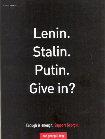
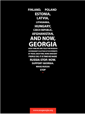
SOS Georgia

Some political posters coming from Georgia at the moment.


Polanoid Polaroid fun

Polanoid.net is building the biggest Polaroid image collection in the world to celebrate the magic of instant photography. There's something timeless and interesting about images taken on Polaroid. Certainly, one of the things I miss most with the increased used of digital photography, are the Polaroids taken by a photograher in the studio as they fine-tune every detail of the lighting and the shot.

One of the things about using 'home' polaroid cameras these days is that a lot of the film is out of date, so you never quite know how the images will turn out. More often than not they have some quality to them which makes them far more interesting than if they were perfectly crisp digital shots.

Lance Wyman

Lance Wyman is the Graphic Designer behind the famous Mexico 68 Olympic logo. He's been creating great work for decades, including the great Minnesota Zoo signage system. Have a look at more of his work on his excellently organised website here.

VIA DELICIOUS INDUSTRIES

Smiles make the world go round


Scottish Water

A man's cupping his hand to scoop water from a Highland burn.
A local Gamekeeper shouts 'Dinnae drink thon water min, its foo o' coo's shite n pish'.
The man replies 'My good fellow, I'm English ...repeat that in English'.
Gamekeeper replies 'I said use both hands - you get more that way'

Try Drugs

We are not endorsing drugs but rather this anti-drugs website. It interacts with the viewer and forcefully communicates its message leaving you with little choice but to 'experience' the site.

A punch in the mouth!

A recent interview with the legendary George Lois after his Esquire Covers exhibition at MoMA. Great to see he is as outspoken as ever!

via Notes On Design

Le Cheapskates

Why do some advertisers insist on treating the good people of Britain like idiots? Renault is currently interrupting my telly-viewing with an ad that is badly overdubbed to the point of being insulting. And not in a funny way either.

At one point the English voice-over-actor-lady says "Shelby" as the French actress clearly mouths "Onions" (or something equally unlike Shelby in French).

It suggests to me that either...

1. Renault thinks its potential customers are idiots who will not notice.
2. Renault realises that its customers will notice, but doesn't care what they think.

Vaguely related - another ad for a Renault...

Russian Bookjackets.

Following on from my previous post on Soviet propaganda posters I discovered a vast resource of Russian book jackets via Viewers Like You.They are taken from a scrapbook of Russian book covers published in 1942, currently held at the New York Public Library.

Digging a little deeper through the NYPL's digital gallery amongst some other stuff I found some great constructivist prints by El Lissitzky.

The Gene Simmons Hall of Fame

A quick update on the Gene Simmons Pinball Hall of Fame, which is basically the high score chart for the Kiss Pinball at Sell! Sell! Towers.

Ryan has stormed into the lead with an impressive 664,940. The top non Sell! Sell! contender is Anna from Nuffield Health with a respectable 290,940. James Mason is next with 244,220 - no not that James Mason, but rather the one from Friends of Sell! Sell! Twelve. Propping up the table are Judith from Delicious Industries, and Jimmy Skinner, also from Twelve.

Ryan 664,940
Vic 608,760
Andy 442,010
Anna 290,940
James Mason 244,220
Sarah 214,550
Mark D 197,620
Richard 165,820
Judith 145,250
Jimmy Skinner 101,320

Zara Illustrates

Some lovely illustration work from Zara Picken.

Soviet Propaganda

A massive flickr collection of Soviet Propaganda Posters.

A smile can brighten the darkest day.


Cursing Fish

One day, a priest decides to take a walk to the pier near his church. He looks around and finally stops to watch a fisherman load his boat. The fisherman notices, and asks the priest if he would like to join him for a couple of hours. The priest agrees. The fisherman asks if the priest has ever fished before; the priest says no. He baits the hook for him and says, "Give it a shot, father."

After a few minutes, the priest hooks a big fish and struggles to get it in the boat. The fisherman says, "Whoa, what a big sonofabitch!"

The priest says, "Ah, please sir, can you mind your language?"

The fisherman responds (thinking quickly), "I'm sorry father, but that's what this fish is called---a sonofabitch!"

"Oh, I'm sorry," says the priest. "I didn't know."

After the trip, the priest brings the fish to the church and spots the bishop. "Eminence, look at this big sonofabitch!"

"Please father," says the bishop. "Mind your language, this is a house of God."

"No, you don't understand," says the priest. "That's what this fish is called, and I caught it. I caught this sonofabitch!"

"Hmmm," says the bishop. "You know, I could clean this sonofabitch and we could have it for dinner."

So the bishop takes the fish and cleans it, and brings it to Mother Superior at the convent.

"Mother Superior, could you cook this sonofabitch for our dinner tonight with the Pope?"

"My lord, what language!" says the mother.

"No, sister," says the bishop. "That's what the fish is called---a sonofabitch! Father caught it, I cleaned it, and we'd like you to cook it"

"Hmmm," replies Mother Superior. "Yes, I'll cook that sonofabitch tonight."

While the Pope is over for dinner that evening he remarks that the fish is superb. He asks where they got it.

"I caught the sonofabitch!" says the priest.

"And I cleaned the sonofabitch!" says the bishop.

"And I cooked the sonofabitch!" says Mother Superior.

The Pope stares at them for a minute with a steely gaze, but then takes off his hat, puts his feet up on the table, and says, "You know, you fuckers are all right.".

One size does not fit all

A picture of lots of shoes (lame metaphor)

A while back, the excellent Ad Contrarian wrote this great post The End Of The World, which got us to thinking why do people in the advertising business persist in jumping, lemming-like, onto a new way of thinking or idea, exclaiming "Everything's all about this now!"?

Every year there seems to be some new thing that is going to be THE big thing forever - that everyone needs to put their marketing money into right now and for ever more or risk withering away like a withery thing.

Here is a, by no means exhaustive, list of Things that were going to be the next big thing forever that we can remember over here in the UK the last few years...

Guerrilla Marketing
Experiential Marketing
Social Networks
User generated content
Branded content
The Red button
Buzz Marketing

Also, it's now apparent that I've written this list that these all have stupid, bullshitty names, no doubt coined to make them sound modern and scientific.
But at one point or another, marketers were being told that they should shove all their money into each of these. How silly.

Currently doing the rounds are two NEW! things - 1. Digital is going to make everything else defunct, 2. That advertising is now all about entertaining, or 'emotional messages' rather than any kind of rational product message.

Honestly, do none of you people out there feel even the slightest bit stupid?

When will people realise that there will always be lots of different ways of solving lots of very different problems for clients. That new things and new thinking is great, but it doesn't mean that all old things are now wrong. That trying to fit every client and every problem into one way of thinking, or one media channel, is incredibly stupid.

In a world... without the great Don LaFontaine


Don LaFontaine died yesterday at the age of 68.
You might not recognise the name but you will recognise the voice. Don was the voice of over 5000 movie trailers and countless commercials, and coined the phrase "In a world..." which seems to start almost every movie trailer I've ever seen. And he wasn't afraid to parody himself either...


Goodbye Don.

Be the coat


I had the dubious pleasure of watching an episode of Australia's Next Top Model on Living last night. There I've said it.

I could have kept that to myself, but I had to share something. On the photoshoot the would-be models were modeling some designer jackets, the photographer, I swear, giving some pre-shoot direction to one of the first models said, very earnestly "I want you to be the coat".

Be the coat.

It's a walk-off!

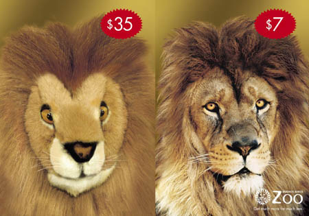
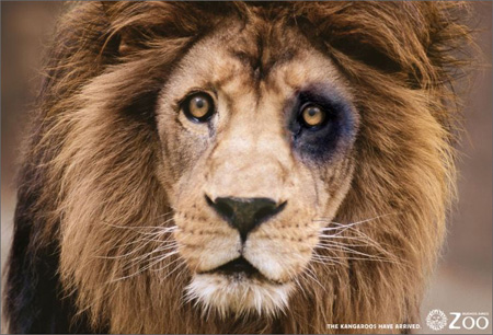
Buenos Aires Zoo Ads

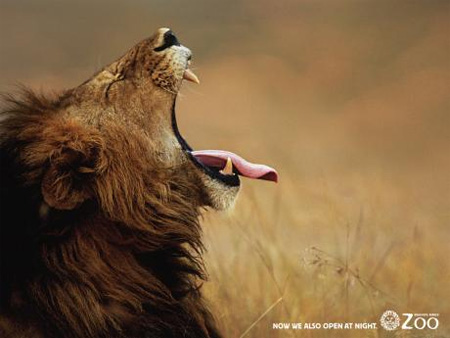
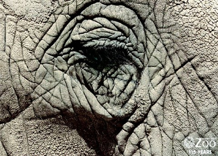
A selection of good ads for the Buenos Aires Zoo by Del Campo Nazca Saatchi & Saatchi advertising agency.
“Get much more for much less”

“The Kangaroos have arrived”


“Now we also open at night”

Buenos Aires Zoo “115 Years”

via Toxel