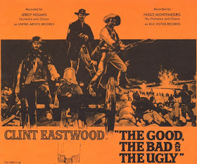
Whistlin' Dixie!
This week Top 5 Tuesday is back with a bang, or rather a bottom-lipped whistle.
In previous Top 5 Tuesdays we have looked at the 5 best: moustaches, Brians, classic sweets and film titles. But this week we've got a real gem, our top 5 whistling songs. Yes thats right, whistling songs.
So without any further ado we present:
1. Scorpions - Wind of Change
2. Peter, Bjorn & John - Young Folks
3. Bobby McFerrin - Don't Worry Be Happy
4. Whistling Jack Smith - I Was Kaiser Bill's Batman
5. Roger "The human whistle" Whittaker
Previous Top 5 Tuesdays:
Handlebars & Horseshoes
Brian & the Brians
Songs from 80s Soundtracks
Classic Sweets
Film Titles
New England football kit
Football & fashion. It's not often that those two things work well together but kit makers Umbro have pulled out all the stops with the launch of the stylish new England strip.
Umbro have gone back to the roots of classic English tailoring to create a classic, bespoke kit for the England team with the help of tailor Charlie Allen. You can find out more about the whole thing here on the Umbro website.
There's some nice touches there; the Umbro logo evolution as the loading bar for one, the hand lettered "Tailored by England" logo, above, and the specially commissioned series of images representing what it means to be English. You can see more of these here.
Oh and if you are in the Shoreditch area there is the oh-so fashionable "pop up store" to go and visit.
Recycled beverage holders
We've just came across these interesting glasses from YAVAglass. The Corona ones have been kicking around various places for a while now but it was the older style, American soda glasses that caught our attention. Particularly the Frucade one with it's vibrant screenprinted colour, bold typography and interesting bottle shape. The vodka glasses are worth a look as well.
Replacing World Landmarks With Cheap Souvenirs
Now this is my kind of project. A great idea, simple, and a bit daft. It's the work photographer Michael Hughes, a freelance photographer who has taken over 100 of these images over ten years. Check out Michael's website here.
FOUND ON THE MOST EXCELLENT MY MODERN MET
PS. Top 5 Tuesday is back tomorrow.
FOUND ON THE MOST EXCELLENT MY MODERN MET
PS. Top 5 Tuesday is back tomorrow.
Waxin' & Milkin'
I'm finding it hard to prize myself away from this visual mixtape blog, courtesy of Mark Malazarte. Waxin' & Milkin' showcases cracking film stills, film and music posters and some very, very nice photographs. And the best part, you keep scrolling and the images just keep coming! Mark's own own prints and designs are spot on too, click here to see his work.
Process Photography
Those lovely photography peoples over at Process have got themselves a shiny new website. It has a crisp, clean look, it's easy to navigate and makes a hero of the work. It feels immediately vibrant and interesting, I'm sure because the work is up front. And it makes use of the web in a smart way - rather than make the images ungrabbable like some photography sites, it actually gives you the opportunity to download a decent decent sized 72dpi file of each shot. Very helpful for creatives and anyone else trying to put reference together or present work. A smart piece of interwebnet design we think. Check it out here.
Of course, the point of the site is that they have some very talented photographers, Louisa Parry, Matthew Murray, Bill Robinson and Ruud Baan are some of our favourites.
Ghost Signs
We're big fans of those old hand-painted adverts on the sides of buildings. I love the craft and skill that went into making them, and the charm that the lettering has compared to modern, cookie-cutter typography. I found these images over on Ghost Signs, a blog dedicated to recording and creating an archive of these pieces.
Pascal's Triangle
Andy Chung's intricate fine line drawings and mathematic designs (recently spotted on Booooooom's blog) are cracking! You can find out more about the shoot, a behind the scenes glimpse as it were, here. Vancouver-based Chung's got a rather good website too. We hope to see more super stuff from him soon.
Change The Record.
Do you remember those kids at school who used to copy what the cool kids were wearing but got it slightly wrong? I had it easy, I was never anywhere near cool. But those kids, they would eat their own hair to look cool.
I think a lot of those trying-hard-to-be-cool kids found their way into advertising recently. I mean, it used to be a business for mavericks and the outspoken, idiot-geniuses and those who couldn't get a job anywhere else. Even if they wanted to. But now it seems agencies are filled with conformists, people trying hard to fit in. Those same kids from school.
And I think it's starting to show in the ads. Advertising seems to have such a narrow scope of tone-of-voice and look. If you look at what is deemed to be the best work over the last few years, it's all within a certain comfort-zone of look and feel, and tone of voice. Slightly knowing, safe middle-class humour, polite little visual films with endlines that sneak apologetically on screen, print ads that try to do everything with a visual joke. Ads that feel slightly ashamed to be ads.
To me, it feels a bit like everyone is aiming for the same point. That no matter what the brief, product or target market they are all trying to get to the same place creatively. The trying-hard-to-be-cool-kids trying hard to do work that will be seen as cool. Maybe that's unfair. But that's how it feels.
What about if we forget what is cool, or accepted as being good, and just try some different approaches? Just for starters... how would the project you're working on come out if...
The product was the only visual you were allowed to use?
You had to only use words of only one syllable?
You weren't able to use any visual in TV commercial?
You only had three words to get your message across?
You had to use over 300 words?
It was a complete disaster of a mess?
You had to use The Muppets?
You had to put a product benefit first and work back from it?
You only have £500?
You only used half of the ad time length?
Your print campaign only had one word in it?
It didn't look finished?
It wrong a bit sounded?
Okay, so they're a bit lame, I know. But hopefully you see what I mean. I'm just trying to point out that there's more than one way to skin this cat called advertising (I'm as confused by that metaphor as you, dear reader).
Better still, what if all the trying-hard-to-be-cool-kids go and do something else in 'the media'? And let the lunatics take back over the asylum. Then we might get back to some more varied and interesting stuff.
Just a thought.
Corporate Diversity: The Book, Not The Management Speak
Corporate Diversity: Swiss Graphic Design and Advertising by Geigy, 1940-1970 is absolutely crammed full of great posters, brochures, packaging and advertising.
The Swiss company Geigy made huge contributions to international design history throughout the 50's and 60's, their work was incredibly simple, graphic and iconic, often compared with the graphic styles and creative genius of brands like Olivetti and Braun.
There really are so many great pieces in this book, it's hard to pick only a few to show.
Corporate Diversity is published by Lars Müller Publishers in association with Museum für Gestaltung Zuurich and can be purchaased here.
The Rainy Season by Andy Smith
Illustrator and all-round-maker-of-smashing-stuff, Andy Smith always sends out really nice things. This latest is no exception, a great little hand screenprinted book 'The Rainy Season' in one of his lovely screenprinted envelopes. Check out his latest work on his website here.
I love his typography especially, this print brightens up the walls of Sell! Towers...
Meatscapes
Nicholas Lampert fuses Americana landscapes with butchers' choicest cuts to create mighty Meatscapes. These strangely captivating pieces graphically represent land use, namely cattle farming, in Lampert's home town of Wisconsin. With pieces like weiners in space, ride to sausage mountain and attention! chicken this undoubtedly bizarre collection is definitely worth a look.
In-flight Safety Announcement
Sick of hearing a dull and boring safety announcement at the beginning of your flight? Then maybe you should travel with Southwest Airlines. They do things a little differently.
We Are One!
This week marks the first anniversary of the Sell! Sell! Blog. And what a lovely year it's been. We've come across a lot of new and interesting things, and we've met a lot of inspiring and friendly people along the way.
A big thanks to everyone, and a special mention to those lovely types who've helped us out and kept us inspired along the way:
Delicious Industries
If This Is A Blog Then What's Christmas
The Ad Contrarian
Dirty Mouse
Rubbishcorp
Notcot
Squa
Noisy Decent Graphics
Thanks a bunch.
And thank you kind reader for taking the time to stop by our corner of the interwebs.
D&AD Lecture series: Peter Saville
This years D&AD President's Lectures started last week with a talk by Peter Saville. Following on from Saville there'll be lectures with Jan van Toorn, David Hillman, Jonathan Ellery, Luke Williamson and Sir John Hegarty, Malcolm Venville, Joel Gethin Lewis will hold one togethor as well.
Here are some of the highlights of Saville's lecture;
You can check out more D&AD videos on Vimeo here.
Here are some of the highlights of Saville's lecture;
You can check out more D&AD videos on Vimeo here.
Great Advertising: What Is It?
Like most other industries, most of what the ad business produces is average. A little is really ugly, and a little is pretty good. And a very, very small amount is great.
I was racking my brain earlier trying to be positive and think of some current advertising that I think is great. I'm sorry to say that I couldn't think of any. Maybe I will. I don't have an inventory of all current advertising in my head, thankfully.
It's one of the reasons that I started doing the Advertising Greatness series on here. I was a little tired of slating stuff (emphasis on a little), and wanted to write about something that inspired me. Unfortunately it was hard to find in contemporary work, so I started thinking back to the really great stuff from the past.
Anyway, I got to thinking what exactly is my definition of Great Advertising? I mean, loads of people talk about it, but everyone seems to have their own definition. That's probably why opinion is so split about the same pieces of work. People are judging by their own criteria of what great advertising is. A lot of ad creatives judge great purely on whether they like it or not, or how creative it is - does it make them laugh? Is it clever? Is it original? Is it so so pretty? Some clients judge purely on whether it worked or not. You can understand both points of view by putting yourself in their shoes.
Here's a shot at my definition of what makes for great advertising:
1. It has real substance
2. It is delivered brilliantly
3. It worked
Currently, I see a lot of advertising that does one of the first two things well, and the other either not at all, or poorly. Ads with substance that treat me like a punk. And entertaining, creative ads that are meaningless.
It's a subject that divides opinion. What's your definition of great advertising?
I was racking my brain earlier trying to be positive and think of some current advertising that I think is great. I'm sorry to say that I couldn't think of any. Maybe I will. I don't have an inventory of all current advertising in my head, thankfully.
It's one of the reasons that I started doing the Advertising Greatness series on here. I was a little tired of slating stuff (emphasis on a little), and wanted to write about something that inspired me. Unfortunately it was hard to find in contemporary work, so I started thinking back to the really great stuff from the past.
Anyway, I got to thinking what exactly is my definition of Great Advertising? I mean, loads of people talk about it, but everyone seems to have their own definition. That's probably why opinion is so split about the same pieces of work. People are judging by their own criteria of what great advertising is. A lot of ad creatives judge great purely on whether they like it or not, or how creative it is - does it make them laugh? Is it clever? Is it original? Is it so so pretty? Some clients judge purely on whether it worked or not. You can understand both points of view by putting yourself in their shoes.
Here's a shot at my definition of what makes for great advertising:
1. It has real substance
2. It is delivered brilliantly
3. It worked
Okay, so great advertising has to do the first two things really well, and work.
Substance means the advertising has to have at its core something that moves the dial, something about the product or subject that people relate to, or that changes peoples' perception to where you want it to be. It has to have something at its heart that means something to the people the message is aimed at, that will cause them to act in the way required by the brief set.However, moving the needle is not, for me, the only definition of great advertising. A successful campaign commercially is not necessarily a great campaign. Yes, it working is a prerequisite of it being a great campaign, but a great campaign doesn't just work. Advertising is an invasion into people's lives. It needs to be additive. Truly great advertising forms a part of a customer's positive experience of the company/brand.
Brilliant delivery means that the way the message is delivered is well thought through and well executed. It doesn't mean it has to be very creadive, this is not about creativity for its own sake, rather creativity for the sole purpose of making the advertising more effective. Creativity that makes it clear which product or brand the advertising is for, that helps people to remember the key parts of the message.The right kind of creativity. Simple if simple is the best solution - but simplicity that doesn't treat me like I'm simple. More dense if that is what is required. Weird where weird helps the delivery of the substance. Straightness where straightness helps the delivery of the substance. Creativity and entertainment are not the aims of advertising, only it's means. Creatives, if you think that your creativity should not be judged on the success or not of the work to meet the objective, I'm sorry but you are very deluded about what your job is.
It worked. This one is crucial because if it didn't work the first two don't matter. Maybe you thought it was great advertising. It didn't work? It wasn't. Sorry. I'm not interested in your excuses. Only advertising that worked can be considered great. Meeting the objective of the brief is the one single constant that you can judge advertising by. That's why the business exists, that's why creativity in advertising exists. If people didn't fundamentally believe that creativity helps make advertising more effective, ad agencies would not have creative departments. Believe me.
Currently, I see a lot of advertising that does one of the first two things well, and the other either not at all, or poorly. Ads with substance that treat me like a punk. And entertaining, creative ads that are meaningless.
It's a subject that divides opinion. What's your definition of great advertising?
Coincidence World
The first UK solo show of MWM Graphics aka Matt W Moore's prints, murals and colourful vector illustrations are currently displayed at Concrete Hermit, until 2nd May. We moseyed on down and were very pleased with what we saw.
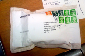
Straight 8
Excitement at Sell! Towers as our Straight 8 film arrives. This will be the first time we've entered, our plan is to shoot next week. Once we figure out how to work this...
Hmmmmmmm.